Thursday, 27 March 2014

Character Creation: Duck-Billed Platypus Part 1

By Meg Sugden 

Modelling the Character
Once we had all of our pre-production complete I moved onto beginning to model out the characters. I used the same technique that I did for the alien and made sure that I used my character turnarounds for reference before beginning from the foot upwards.

I started with the foot, modelling the lower leg and the first toe before adding in the other two. This was fairly difficult as the turnarounds were not quite symmetrical and I had to alter one side so that it stuck out a fair bit in order to ensure that it didn't go onto the other side of the grid; meaning that when it comes to flipping it, it becomes very easy and I can simple mirror this half of the model over hopefully without any trouble. At this point I didn't know what to do with the webbing in between the toes so I decided to leave it for now until I could ask for help.


I then worked my way further up the leg, making sure that I stuck to my references and ensuring that it didn't go over the half way point, so that it didn't mess up the model once I was mirroring it, and so far I am happy with the look of it. I then worked my way up the torso, ensuring that I made the stomach prominent and making sure that it follows the shape of the body correctly.


I then worked my way down this half of the tail of the platypus. This was quite difficult, but I managed to get it to loo okay in the end, although the turnaround again were a little off making it more difficult that it should have been. I started by adding in the basic shape of the tail before adding the finer details as this gave me a good starting point for it.


I then added more detail into the tail, adding the end part to it and then sculpting it so that it had more polygons in the tail to give it more shape.


I then worked further up the head, adding the in neck detail and moving onto adding in the beak. As he doesn't actually have eyes that stick out like normal human eyes, these were rather difficult to add in as I just had to leave a face for them to go in and hope that it will look okay when it will be textured, if not I will have to add in some form of eye later on in the modelling stage.


I added more detail into the face and ensured that the beak fit into correctly into the area and also looked good; which I am really happy with.


I then lastly moved onto modelling the arm and hands to complete this half of the model, before adding in any further smaller details in the end. So far I am very happy with the look of him and it looks like how we wanted at the moment, the tricky part to come is when I have to add in the details like the loin cloth and the pieces of cloth attached around him.

Here is the finished arm/hand. I am extremely happy with the look to it and really think it suits the design of the character, again I haven't added in the webbing as I want to double check the best method for this before doing it.


And then here is the finished first half, without the extra details added on. I really like it and think that it conveys our chubby little character very well and gives him all the right characteristics. There are a few more details that do need adding on like the clothing, but these will be added on in the next blog post.


I then also had a quick look to see how he was looking in a smooth preview, and again it looked great and is definitely heading in the right direction.

Wednesday, 26 March 2014

How ‘Remorse’ could be a trans-media subject


In all honesty, I feel the film is however great just the way it is. Robert Rodriguez argues the point of changing subjects when adapting things into trans-media when describing why he made Sin City such a faithful adaption in the book  Sin City: The Making of the Movie: “I could rewrite it and change it completely and turn it into something else, but why? You’re not making it better, you’re just making it different, and it was so goo just the way it was.” This, without sounding big headed, I feel applies to our film. It is beautifully honest and true and I feel that is integral to it success, appeal and effectiveness. However, I will indulge the few ways this could be done in other media. 

One, would be a graphic novel. As a medium that is aimed at adults that teenagers often have a huge interest in this could be a good way of targeting an audience for the subject. This would obviously have no sound (unless it was a web-comic), but could benefit by having a touching monologue, which we felt wouldn’t work in the film. This could even be just as honest as the film and be like a journal, where the monologue is the exact writing, and the comic would unravel the life of the character. It could however, have nothing but imagery, such as a page in a Marvel comic Ultimatum: X-men/Fantastic Four, where it is revealed The Thing attempts self harm. Though this is not gone into detail (enough in my opinion) it does display more emotion in the troubled character than is often displayed in other comics when he’s just portrayed as ‘down.’ This shows him as a more thought out suffering character who feels far more human now and certain audience members really feel they can relate to him, making his story far more interesting. This I feel would be a good way to correlate the problem where there is more professional control to tell the story you want to tell to no constraints. 

Another idea would be to develop it into a video game. This I feel could never be a AAA title, but as an indie game, such as Gone Home, where you play as a concerned family member finds this out by exploring the house that reveals these secrets. As this is such a personal story the attachment users start to feel for the characters in this title would definitely benefit the experience of a game similar, but may even be more effective. In Gone Home the user finds out that their sister is a lesbian who is struggling trying to make her parents understand, and considering joining the army like her girlfriend. To have the same level of attachment and find out something like a family member is self harming, I feel would be even more effective, and if reading the journal, like you do in Gone Home, would really allow users to understand the mindset of a depressed person. This also would make users to imagine a family member of theirs suffering and as being an interactive medium this may help bring the subject home.

Even a book may be an effective may this subject could be placed in as a trans-media subject. A book that, like a graphic novel, could simply follow the diary, or like the video game, have a character find this out about someone else. It could tell the story of the character and have him narrate the book but personally I feel there are better ways for this to work. Out of this selection for a book, I feel the journal is the best option. Readers could more easily get into the mindset of the character and may be able to relate and be more understanding when confronting the problem in their lives.

The film could also be interoperated as web-isodes, where a section of the story is released every week, and the users could even decide what could happen to the lead character. This might be and effective way of displaying it as if the audience really engaged with the series and kept of watching for a lengthy amount of time, a greater bound and attachment can be made so when they notice someone suffering from this in the real world, they would be more comfortable and confident with approaching the subject as they will have a clearer understanding of how that person is feeling. They may even feel a want to help because they understand how it can affect people and if they can see the signs of it, they could help stop it before it gets worse. 

It could even be exactly how the film it is, but released to self harm charities to help raise awareness. This could be a very effective idea as it would help be able to take a very negative experience and give it a silver lining, by allowing it to be a film to help others who suffer from it. We have already had extremely positive feedback from the film, and feel every faith it has the possibility to do this, and idea we may later explore.
To conclude, I do now feel there would be other ways of telling this story, but it adapting it to different media would be something that could very easily compromise the films integrity if no done with the same level of passion and honesty as the film was. I would like to say the graphic novel would be the best way of doing this, but purely because of Gone Home I feel a video game may well be the best option. Arguably the point in trans-media is something doesn’t have to be constrained to one media, but unfortunately if telling a true story in its most honest sense, there would only be so many times you can re-tell it before it loses effect, unless the story is really dragged out over a long periods of time or told far less honestly, which I feel wouldn’t be nearly as effective.

Monday, 24 March 2014

Responsive: Evaulation


The first thing we did as a group was sit down and come up with a wide range of ideas, even though it was evident from the start the story we would tell. We explored anyway, but the result was enviable, our film would concentrate on the personal and under looked by society subject of self-harm.

I will largely evaluate what my role was and what I brought to the group, to give an understanding of what I contributed and worked on. As did the rest of the group, we each looked at five films which were either true stories, like ours, our told the touching story of a character struggling with a personal issue. Mine were American Gangster, The Wrestler, Trainspotting, I’m not there, and the last King of Scotland. The one we took most inspiration from film making wise was The Wrestler, as it often uses tracking shots of the character and contains an emotional close up scene when the character confess’ his flaws, in a very well scripted and acted scene.

After looking at the moodboards, I produced some concept art of the character costumes, though they were already seen in photos making this a somewhat pointless exercise, I produced them anyway, but wasn’t overly found of them as I knew what I was doing wasn’t really worth while. It did however show the whole costume which some of the photographs didn’t, but in all honestly my time could’ve been better spent while doing this section, which we all came to realise after I had produced them.

I also looked at some audio considerations with Meg, writing up which songs would work best and why, either with relating lyrics or effective sound. Ultimately, we decided original sound would be best, so I got in contact with a musician (Tim Richards) I was recommended to recorded the track, liaised with him what kind of music we were looking for, sent him the animatic and let him know the deadline. We talked often to make sure the music was right and were very pleased with the final outcome, so much so he is now working on the audio development for our next project.

What I found my most difficult contribution was the planning. I was in charge of filming dates and organising locations, all apart from the Student Medical practice, which Callum organised. I got in contact with Stuart Harvey, a tutor on the foundation level at Leeds College of Art who was very helpful in helping organise and letting students know about our filming date and intentions, and to get in contact with us if they wished not to be filmed, he also added that my proposal was very professional and impressive. I then got in contact with the pub/night club Fab Café, so we could shoot in there. I organised this around a time that was more convenient for the managers, staff and customers of Fab Café. Finally, I organised a very tight schedule to film of a train, train station, and then four different areas of Hebden Bridge all to be in a day and arrive back in Leeds for the filming at the Student Medical Practice the following afternoon. I also produced full Method Statements for very shoot, including the cast, crew, times, dates, equipment list, prop list, and schedule for said shoot. I also produced risk assessments for each shoot but as I was the leading actor, many of the risks related to me (such as giving myself a paper-cut), which I knew I as comfortable with, but these also considered damage to college property, and risks that could affect crew.

The last and one of the most pivotal roles I played was being the lead actor. Our director wanted pure honesty, many of the cast were already the same people who were actually there, but as he wanted to concentrate on directing and capturing the imagery perfectly from behind the camera, he wanted me to act as past him as we are twins and look very similar, so this would not jeopardise the fact that what is displayed on screen will show visually what exactly happened.

Taking this role was something I did without second thought but doubted later. I am not an actor, and only have experience in films I’ve made, that have never required this degree of emotion. Also, if my performance was not convincing I could ruin a very personal film that Callum wanted, with good reason, to be made perfectly. I practiced some of the things I would have to do, but as there was no dialogue it did made my job infinitely easier. I looked at some actors I felt excelled in acting with subtly facial expressions, such as Michael Fassbender in Shame, though he doesn’t say much his emotions are clear. Though my performance was not nearly this standard, it did help try to bring a performance that was worthy.

Thought some scene were easier than others, physically on of the hardest was the fight scene, as choreographing had to be changed on location as it looked unrealistic, and started with my back to the other actor, so I couldn’t see where the punch would be exactly coming from. But there were worse ones. The scene where his wounds are revealed to a girl at a party required subtle expressions of shame, embarrassment, humiliation, sadness and anger. Naturally I managed to make my eyes water, and I think this was one of the best acted scene, only second to the next. The bathroom scene was the most difficult. Silly as it sounds, we had a plate of chopped onion as they makes my eyes water, so between cuts I would smell onion to make them water, but after a while this seemed to loose effect for a reason unknown, perhaps my sinuses became accustomed to the smell, and the tears rolled less. I’d like to pretend they were all well acted and faked but it would be a lie.

In conclusion, this ambitious twelve minute film I feel has been our strongest yet. It has been extremely well received, and we’ve had a huge amount of positive feedback, sometimes even from people we don’t know. This gives me the confidence to send this to self-harm charities to help raise awareness, but this decision I would ultimately leave to our director, as it is his story to tell. I am extremely proud of our group and friends for making it possible, including all the special thanks to outside resources for letting us film in certain locations. Everyone involved has worked very hard to have this story told right and put in more than the required time. Everyone has been very respectful of the subject, although me and Callum seem only to be able to makes jokes of the situation in all honesty to hide the fact that its not something we like to discuss.

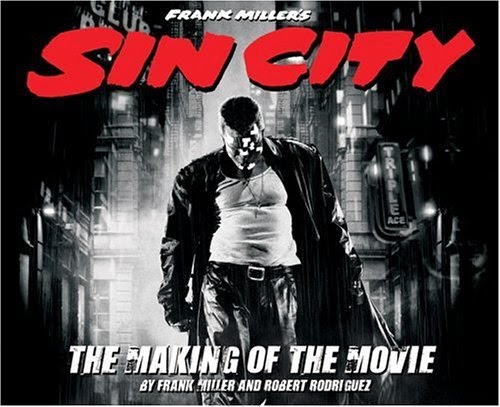
Review of Sin City: The Making of the Movie


Sin City; The making of the movie is a troublemaker publishing book documenting the making of the Sin City movie and how it was adapted from the graphic novels. 

 The book opens with a very effective piece of writing by Miller, taking the reader through the streets of Sin City, which I have already posted up as research. This is a clever way to open as it instantly gives the audience a very good understanding of the Sin City world very quickly. It goes on to have Miller explain the origins of Sin City, what cities inspired it (New York and Los Angeles) and what films and stories helped build it. 

There is also an interesting interview about Robert Rodriguez and Frank Miller about how to approach these graphic novels as a film, and how a very respectful Rodriguez spent a long time tracking Miller down personally to show him that Sin City wasn’t going to be “Robert Rodriguez’s Sin City, it was going to be Frank Millers Sin City, a faithful adaption of his work, and how their would be no development because Miller had already been doing it for 10 years. Rodriguez even paid for the test shoot in Texas with a cast and crew including actor Josh Hartnett, to persuade Miller that this could look just like his comics and be good, a test that actually became the opening to the movie it turned out so well. He explains “I could rewrite it and change it completely and turn it into something else, but why? You’re not making it better, you’re just making it different, and it was so goo just the way it was.” – Robert Rodriguez.  


Part of the book has the entire original unedited script, which is word for word what can be read in the comics. This is displayed along with photos from the shooting (which apart from one set, was entirely green screen) to give readers a taste of how the movie was shot and lit. It also contains art from the comics and short interviews with the actors, crew and directors talking about what it was like working with one another and about some of the characters they portrayed/ created. It also describes some interesting editing techniques such as how two characters who have dialogue and appear together in the film, are two actors who’ve never met. This is by having one actor have their dialogue with a stand in, and vise versa, allowing the director to assemble him dream cast with times that all the actors could make.

It also contains chapters on props, and how they have been designed to look exactly what Miller has drawn, even to the point they researched the type of sword Miller drew, without Miller even knowing he drew a type of sword that existed “I didn’t even know it, but the swords that Miho uses are the same ones that Uma used n Kill Bill.” – Frank Miller. The make up and prosthetics section KNB is also a treat, which shows how much the actors wore to look as close as possible to the drawings of the characters they were portraying. Mickey Rourke had to wear a fake chin and jaw, along with fake eyebrows and nose to look more like his character Marv. Benicio Del Toro even asked to have prosthetics on so he could look more like his character from the comics, while Nick Stahl wore and entire mask of prosthetics and a fake torso to look more like the Yellow Bastard (which was made in blue and faked to look yellow in post, as on the green screen the yellow would have been difficult to differentiate from green.)  

There is section on some storyboards, which Frank Miller would draw on set to help with the position of the camera and framing of the actors. This shows the similarities that comics and films share, only with the exception of sound. Sin City is an extremely faithful adaption that is essentially a moving comic.

The section on costume is particularly interesting, where Nina Proctor (Costume Supervisor) goes into detail about how to take a costume from the comic and make it for film, that is comfortable for the actors and actresses to wear while still looking as outlandish as the comic displays. She also describes how Miller draws lighting unrealistically, and she had to find materials to create the costumes with that would reflect light and give the actors the edge lighting the comic book pages have. She also takes about the value of colour, and how the costume had to not just be made in black and white, but so they would show the right tone when placed in black and white. “I look at everything through a black and white viewfinder for one thing because its all about the value of colour, and not colour itself.” – Nina Proctor. 


There is even a chapter on the cars of Sin City, and how the crew had to track down and find some cars that were drawn by Miller, for what all they knew he could’ve made up. “I thought the only place The Yellow bastards car existed was in Millers mind, because it did not resemble anything I was familiar with.” He later found out it was a Bugatti, an Atlantic 57 C that hade been made in 1936, 1937 and one in 1938. This shows further the amount of dedication that went to replicating Millers drawings, even that one car even had to have the same number plate that Miller had drawn.

The book is definitely a worthwhile read for any fan of Sin City or graphic Novels, film production of any kind and visual effects. It shows in great detail how faithful the movie is to Miller’s comic series and by using green screen how sort filming actually took, (Mickey Rourke, one of the leading parts, only had to do fifteen days of shooting.) It also shows an appreciation for all crew involved, where many films only really give credit to the actors, who actually don’t have nearly as hard of stressful job as many of the crew. They interview them more and go into detail exactly what their job was and the lengths they went to do it, which makes it a great read for anyone wanting to excel in a certain area of film production. The documentation is superb, with many set photos and production stills of make up, prosthetics and costumes. The only thing the book doesn’t go into enough detail on in post, mentioned a few times, there is no real indulgent into how the environments where made for such a heavily computer generated film, including buildings, trees, grass, smoke, snow, and rain, only that it wasn’t too complicated process, which is in a way insulting for students who study computer generated imagery and know that making photo realistic environments for film or video game, is no easy task.

Evaluation


Throughout this project I feel I have worked hard and produced good final out comes. I went to all the lectures and seminars I could and went into great detail about the subjects we looked at giving examples and my thoughts on my blog, perhaps sometimes going off on tangents but remained relative. My essay I feel was well researched and informed, giving good examples to my somewhat controversial arguments backed up with quotations and images, resulting in what I feel is an interesting look into a subject that is not often considered to have double standards. I am also proud of my practical element that I feel achieved its goal and could co-exist in the Sin City universe with the other characters. I also think she has a good backstory and motive to her making her more interesting than the average character.

My only self-criticism would be that I started the essay and practical late, as I was concentrating on other work, to try and get the best possible grade.  This resulted in trying to balance a total of four college projects all having deadlines in the last week of March, which became very stressful but I am very proud of what I have achieved and feel I have produced a very good amount of work and outcome for all the projects I have been balancing.

If I had more time on this project I think I would have spent more time designing the character and producing design boards, as although I am proud of the character and her final appearance, I feel I could have gone into more detail on types of coat, mask and gloves when coming up with ideas, despite I imagine she would have ended up looking the same.  I feel the essay couldn’t have been much improved, as I was pushing the word count but would have liked to contain more theory within it, but I simply couldn’t delete any more as I felt it all contained good points and arguments relating to the subject matter. I am however very pleased with the amount of detail I indulged into considering the lectures and seminars as I have worked better at this than ever previously, and although I didn’t attend every one the ones I did I excelled at when blogging about them, relating the theories to various media and designs.

In conclusion, I feel I have completed all the work required to a high standard spending more than enough time on the project. My only regret being that with so many deadlines, including a Game Art Machinima interim crit, the D&AD brief deadline, the Responsive deadline approaching very quickly and this Context of Practice project all being in for a week of each other has produced a lot of stress and perhaps made me rush some parts of the design process of my practical, as I had so many commitments and projects to try and make to the best possible standard. If I could change one thing, not including this fact, it would be that I could sped more time on my practical, designing the character and perhaps producing art of her alongside other Sin City characters to really blend her in.

Sunday, 23 March 2014

Final character: in the style of the Sin City movie

And here is my character drawn in a realistic fashion to demonstrate how she would look in a film adaption of her comic, such as a Sin City sequel. I am very proud of my piece and could easily visualise her in Sin City, which was my goal. I also think she is a strong enough character to headline her own story, and due to her complicated nature could be the hero or villain, though I imagine her as the hero of her story.


Final charatcer: In the style of Frank Miller

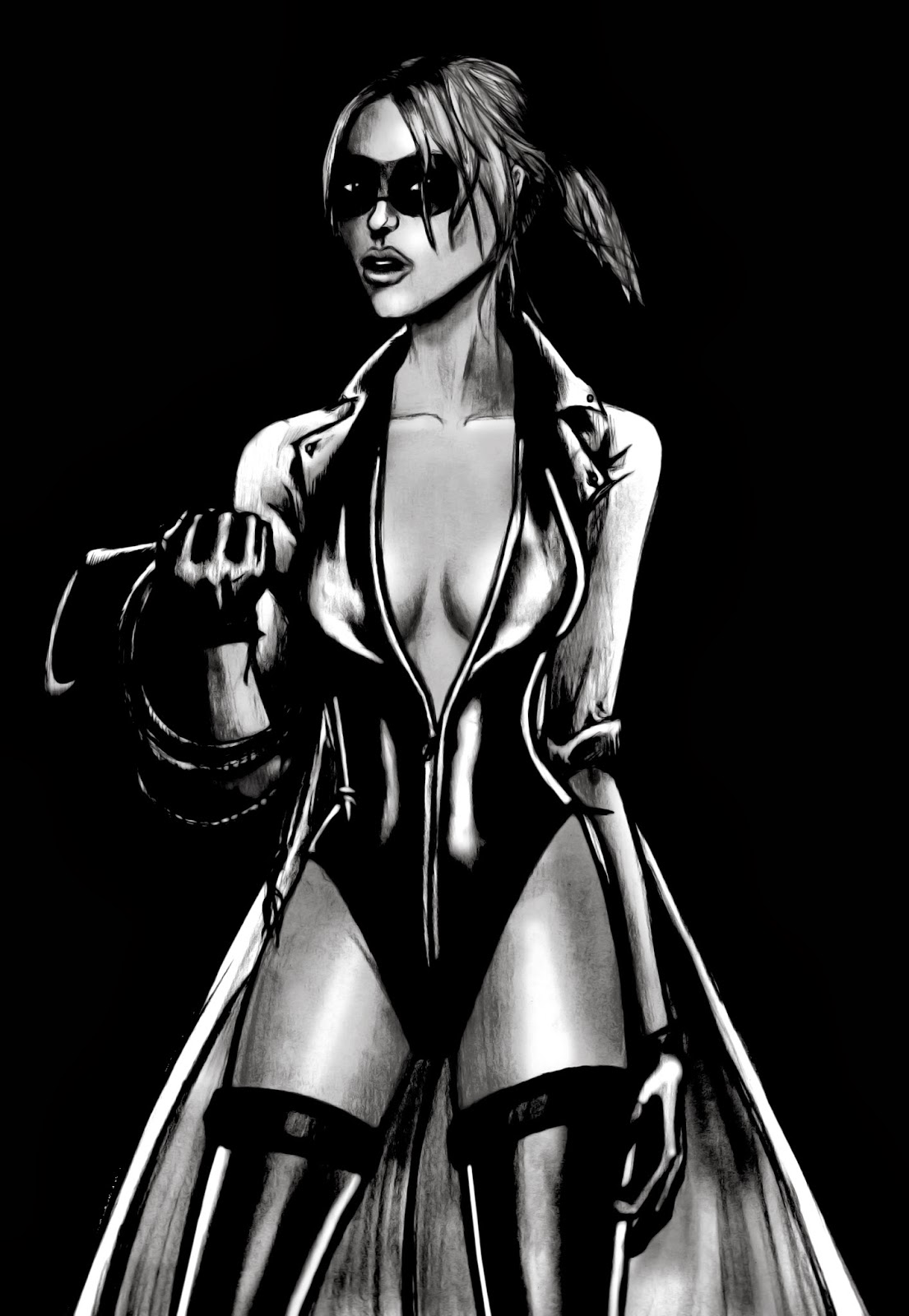
Here are the images of my character 'The Angel' I illustrated in the style of Frank Miller. I did this so I could see how she would look in a Sin City comic book, and I feel it is completely plausible.  I also like the pose as it is the one I mentioned in an earlier post about why she is called the Angel. This would be the first photograph caught of her and published in a newspaper that labels her 'The Angel' as a gust of wind has made it look like her hair is a halo and her white coat wings, I very much like this idea. I also experimented with glimpses of colour in the drawing, but am unsure which I like best. I feel the black and white version is visually the strongest, but the one with her blonde hair emphasizes the halo-look.


Final Character

Here is my final design for my character. I am proud of this design and could easily see it working in Millers work. I have also produced turn arounds so the charcter can be seen from different angles to easily understand her costume. I personally dislike the turn arounds, as I feel they make her look somewhat plain, but they do the job they are ment to and I can easily see how good the character looks in a more natural pose.


Character Development Proforma

I then started to think about the character before developing her appearance further. Filling in the proforma helped gain an understanding of who she is and her personality. I think this character would both fit in Sin City well, as well as be a challenging one. She has the tough nature of the girls while still having the appearance being overly sexualised, but she isn't from Sin City, and actually dislikes it heavily where as most characters love the City. Also Miller has worked on a lot of Batman and DareDevil comics, as well as directing the Spirit film, so a vigilante seems like a character he very well could bring into Sin City, and I feel her back story makes her interesting though harsh, and her methods would be understandable but wrong, which would make her a fun character to read and watch.


Name:
‘The Angel’

Physical Description:

Has blonde tied back hair, a thin mask covering her eyes, thigh high boots and a long white trench coat, with rolled up sleeves and thick leather gloves.  
Character Traits:

Brave, Fearless, Aggressive, Proud, Violent, Domineering, Dedicated, and Mysterious to others.

Character Background

Family Background
Habits/Vices
Ever since she was a child she was a keen dancer and acrobat, which she was just looking for a job in. Her husband was newly transferred to the Basin City Police force, when attempting to expose the corruptness he was murdered. This changed her, seeing a good man killed for doing what is right. She traveled her with a heavy disliking to the city, she knew its reputation and has never wanted to visit, but she wanted revenge. A vision to murder every corrupt official in there.

Makes rash decisions. Only is in her crime fighting for revenge but takes disliking to the violence against women in Sin City that the Old Town girls can’t protect, and for that matter the murder of any good person, as they reflect her late husband. She can become rash and overly violent when angry. Doesn’t care about proof, exposing the law, or courts, their all corrupt and if her husband couldn’t do it no one can. She only cares for what is for the greater good, murder of the evil until there are none left.

Education
Personality
As dancer she is in very good shape, and has quick reflexes and this makes her good in a fight. Her acrobatic skills make it easy for her to apply these in combat and travel across rooftops in a free running style. Recently, she has studied a wide range of weapons to help her in her quest.

She was a sweet and happy woman, who enjoyed life, but with the passing of her hero cop husband she spiraled downwards. She became obsessed with her biased vision of right and thinks that every person in prison should simply be murdered, free up the over-crowded cities and make the world a better place. Her vision of crime became very black and white through the fact it took what was most important to her. 

Likes
Dislikes
The outside, the rain, and murdering bad people.


Corrupt authority, criminals, and unstable high heels.


Motivation

What is their goal?
What is their plan to achieve their goal?
Clean up Sin City. Dispose of the evil characters that lurk there and the corrupt people in charge. Perpetrate those who killed her husband and men like them.

Prowl the rooftops and alleyways looking for trouble. Eventually work here way up to killing the corrupt when finding out information about them.