Friday 29 November 2013

Context of Practice Lecture 8: Censorship and Truth

In this lecture we covered the notions of Censorship and truth, the indexical qualities of Photography and rendering truth, Photographic manipulation and the documentation and rendering truth, censorship in adverting, censorship in art and photography.

Editing photographs is not new skill, though with computer programmes such as Photoshop it has become far easier. Photographer Ansel Adams used this technique in throughout his career especially in his 1958 image 'Aspens.' He edited these photos by 'dark room manipulation' where he would alter the light levels and cover certain areas up to create different contrasts in places of his images.

This was also done for political value such as this 1917 photo of Starlin with, and without Trotsky:

This shows the slim line between what is real and what is digitally and or what is directly manipulated that alters the truth and questions if this was convincingly done in 1917, how much of modern media is truth?

Sometimes too much truth is shown, such as Ken Jarecke's photograph taken in the 'Mile of Death' in the gulf war called "Iraqi soldier" which was banned from the front page in 1992 after too many complaints. This is too much as people reading the paper and eating their breakfast were put off by this image, weather that is right or wrong is questionable. People sat comfortable in their homes looking at the innocent dead killed by friendly fire.

This advertisement for Opium perfume was banned in 2000 for its sexual content and henceforth complaints. It was 'the most complained about advertisement in the last 5 years' but rotated 90 degrees so the image was upright, it became perfectly acceptable. It could be argued offense was taken because the woman looks to be in some sort of high state, with the title 'Opium' emphasis this. Or it could be for its sexual content and her nipple showing, but why this is lessened by turning her vertical is beyond me.

However, when a photo like this is banned, I find it strange pieces like Agnolo Branzino's 1545 piece Venus, Cupid, Fully of Time (where a mother and son are kissing naked while the son touches the mothers breast) and Balthus's paintings of sexualised young girls (such as 1945 the golden years, and 1938 Therese dreaming) are not. Even things like when in 1981 Andy Earl's Bow wow wow cover (inspired by the 1832 painting Dejeuner sur L'Herbe) can get away with being allowed with a naked 15 year old girl on the front cover, but an advertisement of an girl of age is banned, to me is a sign of a very strange system indeed. But perhaps this is under the obscenity
law, which differentiates from protecting art and prohibiting trash, to me, however, I see painted pictures of clothed but sexualised underage girls more offensive than a photograph of a naked woman of age.


Tuesday 26 November 2013

Context of practice Seminar 4

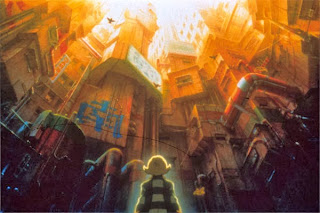
Today's seminar covered much of what we have seen in the previous lectures as we haven't had a seminar for almost a month. It began with Fritz Lang's 1927 film Metropolis, and how the futuristic, technological, imposing city and its effects on the characters. This was later re-made by Japanese animator Rintaro in 2001. I'm not a particular fan of Manga as I feel it over exaggerated in every sense, and while comics do this its is done with individual characters and colourful, funny, exciting stories, where as Manga's characters often look very similar due to the style, and although it depends on the film or comic, it often uses random flashing backgrounds to the characters to unnecessarily exemplify a certain action. This said, this particular animation seemed to contain a more thought out story (as it is adapted) and the trailer hinted at the huge futuristic city being villainous in the sense that it had to be over thrown/destroyed by a set of characters. Although I find it often the city is often displayed as villainous in comics, as it is often riddled with crime (for heroes to fight) and
perpetuates the crime and violent behavior by certain citizens. Arguably cities have higher crime rates as more people live there, but also they often have more homeless people (begging in crowded areas is more opportunity for money) and housing is often cheaper in the outskirts of cities and housing estates, and people with less money become more desperate and are inclined to steal. However, I also think that huge grid like features towering above citizens can create the feeling of lees power and weakness, which frighten people. It also means quicker escape form crimes as there is far more places to hide and blend into crowds.

We also talked about the Oneiric house,  (a term used by Gaston Bachelard) where the attic was a place of happy memories, the middle floors of everyday living, but the basement hides dark secrets and unwanted horrors. This reminded my on indie game Gone Home (2013), where you arrive home to find your sister missing, parents away, and must explore the house to find out whats happened. The following contain SPOILERS. The game finishes in the attic, where it is revealed that your sister, after falling in love with a girl who desperately wanted to join the army, backed out due to their love and you sister has gone to pick her up, so its a very happy ending, where in the attic the area the two girls would seek up to be alone and together away from their judgmental parents. The two middle floors are the everyday living space, but
through secret passages and the basement you find out the truth about your great uncle who was sent to a
mental institute, and down there you find newspaper cuttings of victims and strange contraptions. The game is a brilliant one that uses very little gameplay other than "pick up" or "flick switch" buts story and script make it one of the best I've played. It also closely follows Bachelards rule of the oneiric house exactly, and demonstrates how it works perfectly. I would highly advise this to anyone who is a fan of games, film, or any kind of storytelling.

We also looked at "architectural fear," a term used in Juhani Pallasmaa's "The Architecture of image: Exitentail space in cinema" in which describes how the architecture of a house or building can create a uneasy and scary atmosphere. We talked about how Hitchcock used this in Psycho, and Stanley Kubric did in the Shinning. The idea of a only empty house in a rural area creating a sense of loneliness and dominance among the characters in the setting. I also noticed this in the comic Hellboy: Seed of destruction (by Mike Mignola, 2002,) which was turned into the original motion picture, but the house in witch the comic was set did not appear. This was the setting for the whole comic, were strange events were happening, and a strange amount of frogs started appearing. It is described as:

 "The Cavendish Hall was built about a hundred and fifty years ago by the first of the Cavendish family to come to America. Back then it stood on a high promontory commanding view of the lake and all the land around as far as the horizon. These days it swell on the way to having a swimming pool for a basement. Its been sinking since the day it was finished. Ohh and did I mention there's supposed to be a curse of the place? Not the house itself. The land. The lake. the Local Indians kept well clear of this area for a couple of thousand years before the Cavendish family arrived. You may think curses are just eye-wash, but I don't. I've seen way too much that makes me think otherwise. Way too much."

This appears on the first page of the comic, showing the locations vital part of the story. It also contains Bachelards rule, as the climax and monsters reside in the watery basements of the house. It is a tall and imposing house, displaying power across the land in it height, but as it sinks further and further into the earth it seems to become more and more sinister, violent and mysterious. Hellboy: Seed of Destruction uses influence from H.P Lovecraft and in my opinion the film, brilliant as it is, should have closely followed the comic as it is far more unique in the superhero genre, combining elements of horror and bold, sharp, eye catching, beautiful art.

Monday 25 November 2013

Thought Bubble: Richard Starkings

Richard Starkings is the incredibly imaginative and talented creator and illustrator of Elephantmen. His use of anthropomorphism is fantastic and I particularly like the comics cinematic atmosphere (it has just been signed on for a movie deal.)

When looking at our work he said that he thinks our art was great should work on panels and pages. He said pin up pieces and concept art is far easier than telling a sequential story, and that should be our focus now. He liked the comic vibe, and thought the style worked. He also said (which I thought was great advise) "you can't listen to everyone's critique, because its opinion and we may all say different things contradicting one another. what you should do is take the all round vibe and go with it. Talent, precision and perfection in drawing isn't always necessary, as long as readers can see the love and devotion put into the work." He also said that in comics you needn't work on stories 3 point arcs like films as they are different media, and what works in one may not work in the other. When writing a story you should throw all your ideas in, toss them on their heads and not worry about critiques too much.

He also said that the style was good, but he did say "that's a lot of brown, comic's like Jack Kirby's art is full of colour and brightness, and by your colour range it seems this story is more gritty." It is, far more than the golden age of comics and marvel. Looking at the colours in his work displays that this scheme is one to visually help tell the story and set atmosphere (something Starkings does very well.) As he said "readers should be able to tell the story through the images, which is why you should consider the art and page layout over the script."

This feedback was fantastic, everything everybody was very flattering and pleasing, and seemed that what we should now focus on is developing the pages and working on that element of the comic, essentially to move on to the next stage of our project, and consider offering more pieces of story and what the comic will actually look like the next time we look for feedback on this project.


Though Bubble: Mondo

 Mondo's art on movie posters uses a harsh contrast in angular geometric shapes slicing through the human figure, a process repeated in much of his work, perhaps symbolic of humans in the city scape and its relation to the superhero genre (a genre of which most of his work relates too). I do however think this is brilliantly original and looks fantastic. his illustrative technique is fantastic as it combines a realistic style with accurate actors features with a strangle cartoon look used in colour.

When looking at our work, he looked for a while and said "Its very hard to fault, I think its great. The gear and weapons are nice, over all fantastic." He also while looking for a something to say showed it to movie poster designer Olly Moss (who did this poster for Star Wars Episode 3), and said "They're looking for a critique, what do you think?" Too which he nodded his head and said "Yeah, they're really good."

This kind of feedback was amazing, as everyone seemed to be saying the same thing and that was 'this is great, move on to stage 2.'


Thought Bubble: Amrit Birdi

Amrit Birdi is a freelance illustrator and comic book artist, who's work I greatly admire for its detail and perfect anatomy.

When looking at our work, not to blow my own trumpet but was very impressed. He was surprised that we draw separate characters but composite them together, but loved that fact as it was unique and thought we should defiantly continue that. As for the art he said " It is comic worthy already and I don't think you should change anything about it."

This day was going very well. To get feedback like this from an industry artist working on titles like Daredevil was immensely flattering and pleasing to hear, I didn't expect compliments like this, as I was initially looking for constructive criticism.

Though Bubble: Des Taylor

Des Taylor is a pop artist and passionate comic illustrator, with a very unique and recognizable style, his art rarely goes unnoticed. His use of colour and style is clearly influenced by the golden age of comics, and with his new graphic novel aimed at a female audience "The trouble with Katie Rogers" his work is a fantastically original and beautifully illustrated.

When we showed our work to Des Taylor, he said as a pitch to an investor or employer, we need to work on the presentation of our work. It should be put in binders, with character bio's so that reviewers can get a better understanding of the characters. There should also be the title, character name and logo on each sheet. We should also collect all the work we have on our project and copyright it immediately, by simply sending it to ourselves and not opening it. This will ensure no artist we ask critiques from will try and steal our wok or ideas. He did however think our work was of a high standard and thought that the style was very good, and that we needn't work further on our illustrative abilities. This was again very good advise, as I think showing it in a professional format presentation wise will also add much to the professional look of the work, but again as he thought the illustrations were great and comic worthy, and certainly concept art worthy, I was very happy with what I heard.

Thought Bubble: David Baldeon

David Baldeon is a comic book artist who has worked most famously on Marvel comics, including Ultimate Fantastic Four and X-Men: Legacy. His art combines just the right amount of detail with a cartoony, charactertured look with dynamic composition and and shot types.

Me and my brother attended this convention primarily  to gain feedback on our work, which is a 300 page screenplay (or script) we are developing into a comic.

Upon viewing our work, he said that there are slight things we could do to improve our anatomy skills,  but overall its worthy to be in comics. If its concept art for game its perfect already, but for comic art we need to work on pages as composition and page layout in sequential story telling are key. Working more on pages seemed to be his greatest advise, and if we wanted a company to pick up this project they would want to see how we visually tell a story.

I was flattered at this feedback as it was the best we've had thus far, and to be told that our illustrations and characters are of a professional standard was incredbile. I completely understand that if a company were to review this that they would want to see pages and layout, and as the next stage of our development was what we should do next it was truly fantastic to hear. I will however continue work on anatomy as it is common we hear this when I am having our work reviewed.

Thursday 21 November 2013

Responsive: Choosing an idea

For me, there is one idea in this collection that stands out. It the same as the first one that jumped to my mind that might be uncomfortable to talk about, but I do think it would prove most effective. It is about my brothers self harming years. This is a issue that is becoming more and more apparent and effected my family hugely. Though we were lucky, others are not. Self harm is a growing issue in Britain and beyond and one that I feel dose need more attention. Many suffer and it can often lead to suicide. So for our project, we will look at this, what caused it, what stopped it, and what life was like during it. Obviously it is a very sensitive issue in this group but hopefully we will work through bad memories of this time and produce an effective piece, with 1st hand research to reference. Though I know times of this project will be difficult, if the piece is effective it would be nice for others to see it, if they suffer from it also, to know there are others who have been through it and come out the other side, now perfectly happy.

Context of Practice Lecture 7: Globlization, Sustainability and the Media.

Today's lecture focused on Cultural Imperialism and the spread of the Capitalist  way of life, and different views on Globalization. Firstly was the definitions of how globalism would benefit communism and capitalism.

Socialist (communism) - The process of transformation of local or regional phenomena into global ones. It can be described as a process by which the people of the world are unified into a single society and function together. This process is a combination of economic, technological, sociocultural and political forces. Globalization of this would benefit as the more people involved in this system would produce an increased number of beneficial and advanced outcomes for the socialist group.

Capitalist - The elimination of state-enforced restrictions on exchange across political borders and to the increasing integrated and global system of exchange, commerce, and production that emerges as a result of such eliminations of state-enforced restrictions on exchange across political borders. Globalization would benefit this as the wider the spread on capitalism the more money would be made to corporations that can then expand their bushiness even further globally.

Capitalist globalization has happened, and even influenced cultural globalization, for example; 'McDonaldization.' Sociologist George Ritzer coined this term and i defined in his own words "McDonaldization is the wide ranging sociocultural process by which the principles of the fast food restaurant are coming to dominate more and more sectors of American society as well as the rest of the world." This clearly is what happened as a McDonald's can now be found in nearly every major city in the world, emphasizing the capitalist cultural globalization growth.

Marshall McLuhan predicted in 1964 that "Today after more than a century of electric technology, we have extended our central nervous system in a global embrace, abolishing both space and time as far as our planet is concerned." This is true in the sense that we can listen and see events live on the other side of the planet, but his "Global Village Thesis" is more of a idealistic view of the future rather than a realistic one.

The Global Village Thesis is that in the future technology would've got so advanced the world would be more like a village, with easy communications between countries and that this would unite the world and that we would help and benefit each other in centripetal forces (a global united society). This clearly did not happen, as although this could be said for some countries, the effects of technology has also created advanced weapons systems and seems to have influenced Centrifugal forces (that would tear the world apart in tribal wars) where rather than help each other, it seems within human nature to over rule others and take what possessions said country require (such as oil.)

Problems with Globalization
  • Sovereignty - Challenges the idea of nation state
  • Accountability - Transnational forces and organizations: Who controls the vastly expanding powerful businesses?
  • Identity - Who are we? If the whole world were to accept British culture, we would loose our identity as a country, as 'what is means to be British', would simply be 'what human society is'.
Accountability I see as the most dangerous flaw. For example, large corporations and companies may have laws in certain countries, but as they expand into different countries and continents these laws no longer apply and they become hard to control. Essentially 6 companies control the worlds media through possession various other media corporations. All of which are American. If one company controls the vast output of the worlds media, the news we receive is a biased, American, capitalist out-look on the world. This is called Cultural Imperialism.

Another example is Rupert Murdoch. Rupert Murdoch owns:
  1. The News of the World
  2. The Sun
  3. The Sunday Times
  4. The Times 
  5. NY Post 
  6. BSkyB
  7. Fox T.V
 He then used these media's to influence peoples views on political parties, to then influence who got voted into power. He did this in exchange laws on expanding business to give himself even more power. This kind of power is ever-growing and seemingly limitless, as is Sourcing. Sourcing is the idea that the only news reported is that of news that the companies want reported to benefit themselves and partners, businesses and the highest paying politicians.

Even Films made like Al Gore "An Inconvenient Truth" (2006) Directed by Davis Guggenheim that is in dramatic favor of the increasing global warming and climate change,  advising people to release less CO2, plant more vegetation, try to be CO2 neutral, recycle,  buy a hybrid vehicle, encourage everyone you know to then watch this film, is although trying to make a difference, still using a capitalist out-look for people to 'Buy more stuff to support expanding businesses to make more money."

Sustainability is the term that means "The development that meets the needs of the present without compromising  the needs of the future." While this is a good thought it is business that will always put present 1st and future 2nd.

Many companies also use 'Green washing,' by putting lots of symbols of products packaging, using unbleached paper, and emotional message, earthly tones and certain type faces (usually sans serif) to give the impression that they are a 'green' company aware that consumers are more likely to buy this product, even though it has little to no difference to other products. The only real solution is to tackle the real problem or climate change: globalization of expanding, powerful businesses  emitting huge amounts of CO2.

Wednesday 20 November 2013

Annamatics

Here are two annamatics, one of my directors cut (1 minute 35 seconds) at this link: http://www.youtube.com/watch?v=EmYqJb5C-ko&feature=youtu.be/EmYqJb5C-ko  and one meeting the requirements of the brief (1 minute) at this link: http://www.youtube.com/watch?v=ujWJaoQ9RfE&feature=youtu.be, however, this option as no dialogue as there was no time.I much prefer the longer version for its humor, story and overall effect. I think it makes a much stronger piece of film of better quality, but as far as a fight sequence goes I still feel the 1 minute version is well choreographed and works effectively.

Storyboards: 2

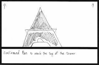
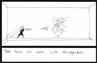
Here are my developed storyboards for my new idea, which may be shortened to a minute if necessary. Although these drawings are very basic I feel they convey what happens accurately and could also be used in my annamatic.